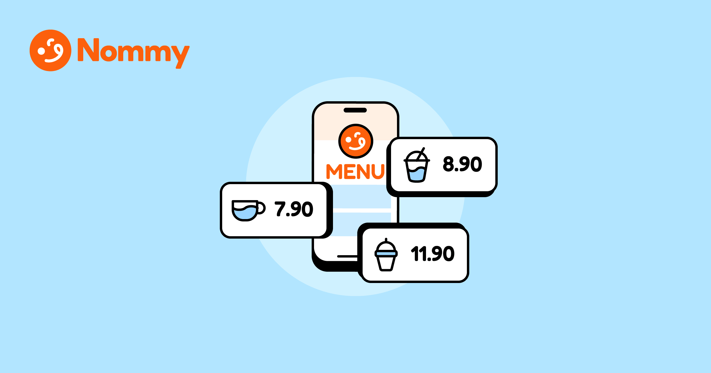
Removing currency signs from a digital menu can increase average order value because the symbol ($, €, £) draws attention to the payment itself, while a plain number reads as just another detail about the dish.
A 2009 Cornell University study, conducted at an upscale-casual restaurant during lunch service, found that guests given menus without dollar signs spent roughly 8% more (about $5.55 per person) than those who saw prices formatted with symbols. The price stays fully visible—only the friction-causing symbol is dropped.
This is the third lever in digital menu optimization. Once category structure makes items easy to find and menu photos make high-margin dishes look appetizing, pricing psychology is what nudges guests from browsing to spending.
For the foundational setup—QR mechanics, placement, and how live menus work alongside printable menus—pair this with our complete guide to digital and QR code menus.
Why does removing currency signs increase spending?
Currency signs act as a pain trigger. Every time a guest sees a dollar sign, euro sign, or pound sign, their brain registers the cost as a transaction—a reminder that money is leaving their wallet. The number alone does not carry the same weight. “12” reads as an attribute of the dish, the same way “served with fries” does. “$12.00” reads as a prompt to be cautious.
This effect was measured in a 2009 Cornell University study, published in the International Journal of Hospitality Management. Researchers tested three formats—dollar signs ($12.00), plain numerals (12), and the written word (“twelve dollars”)—at St. Andrew’s Cafe, an upscale-casual restaurant on Cornell’s campus, during lunch service.
Guests given the numeral-only format spent roughly 8% more (about $5.55 per person). The absence of the currency symbol reduced price salience without reducing price transparency, because every guest still knew exactly what things cost.
One caveat: the study tested a single restaurant at lunch. It is strong evidence that removing symbols can increase spend, not a guarantee that it will in every venue. That said, the principle generalizes to any currency marker—€, £, and regional symbols like RM or ฿ all function the same way. The symbol itself, not the denomination, is what reminds guests they are spending money.
The mechanism is straightforward. Lower price salience means guests spend less mental energy calculating and comparing. They browse longer, explore higher-priced items, and are less likely to default to the cheapest option. The price is never hidden—it is just formatted so that the food, not the math, stays in the foreground.
How should prices be formatted on a digital menu?
Format prices as plain numerals, on the same line as the item name, without currency symbols or unnecessary trailing decimals.
| Format | Example | Effect |
|---|---|---|
| Plain numeral | 12 | Lowest price salience—highest spend |
| With symbol | $12.00 | High salience—triggers payment awareness |
| Written out | Twelve dollars | High salience—performs poorly compared to plain numerals |
| No price | — | Breeds distrust; guests assume the worst |
A few practical rules:
- Remove .00, keep meaningful decimals. “12” is cleaner than “12.00”; trailing zeros imply precision, which draws attention to the exact cost. But if decimals are culturally or legally expected—as with €12,50 in much of Europe, or tax-inclusive pricing in Japan—keep them. Drop the unnecessary ones, not all of them.
- Keep the price on the same line as the item name, visually de-emphasized. On mobile-first QR menus, right-aligned prices often wrap awkwardly. Keep the number next to the dish name, de-emphasized through weight and color rather than position. Right-align works on desktop and tablet where there is room; on a phone, same-line is safer.
- Keep prices visible on every item. Removing the symbol is not the same as removing the price. Hiding prices breeds distrust and pushes guests to ask staff, which defeats the purpose of a self-service menu. For more on why missing prices backfire, see our guide on common digital menu design mistakes.
- Make the price scannable by weight, not loudness. Once the symbol is gone, the numeral should stand out enough to find at a glance—bold weight works—without being the loudest element on the screen. On a digital menu, the food should draw the eye first; the price should be easy to locate, not impossible to miss.
What about multi-currency and tourist-heavy venues?
Removing currency signs works differently when guests genuinely do not know what currency the prices are in. A tourist in Bangkok scanning a QR menu that says “120” has no idea if that is baht, rupees, or ringgit without context. In these situations, the goal shifts from reducing price salience to removing ambiguity.
The fix is a single currency indicator at the top or bottom of the menu—not a symbol on every line. A one-line note like “All prices in EUR” or “All prices in USD” tells guests what they are paying without reattaching a symbol to every item. The same approach works in any region (“All prices in THB,” “Prices in RM,” etc.). The menu still gets the salience benefit of plain numerals on each line, and the guest gets the clarity they need to order with confidence.
| Venue type | Currency approach |
|---|---|
| Domestic, single currency | Plain numerals, no symbols |
| Tourist-heavy, single local currency | Plain numerals + one-line indicator (e.g. “All prices in EUR / USD”); use SGD, RM, or ¥ as needed for the region |
| Multi-currency (e.g. border towns) | Plain numerals + explicit currency label per category |
| Airport / transit hub | Currency indicator required; consider dual display if common |
| Third-party delivery / marketplace | Follow the platform’s required pricing format |
| Regulated / tax-sensitive market | Follow local price-display laws over formatting preferences |
The principle is the same: give the guest enough information to feel confident, then let the number stand on its own. A currency symbol on every single line is overkill; no indicator at all creates confusion. The sweet spot is one clear statement of the currency, then plain numerals throughout.
One more thing for international operators: tax display rules vary. In the EU, UK, and Australia, prices must be tax-inclusive and clearly legible. In the US, tax-exclusive pricing is standard and sales tax is added at checkout. This article is about symbol removal, not tax display—always keep total clarity over formatting preference, and follow local price-display laws where they apply.
The exception is third-party platforms: delivery apps and marketplaces often enforce their own pricing format, and those rules always take priority. Reduce friction where you control the format; comply where you do not.
How does price anchoring work on a digital menu?
Price anchoring works by making the first price a guest sees in a category the mental benchmark for everything that follows. If the first item in “Mains” is 42, the 28 steak below it feels like a reasonable mid-range choice. If the category opens at 18, that same 28 steak feels expensive. The anchor sets the frame; every subsequent price is judged relative to it.
To use it: place your most expensive high-margin item first in each category (not your best seller—the item that makes everything below it look like a good deal), make sure the anchor is genuinely desirable, and cluster your target-margin items in the second and third positions where attention is highest. These are the prime spots for dishes that combine high margins with a mouth-watering smartphone photo.
Anchoring compounds with currency-sign removal. A plain “42” at the top of a category makes “28” below it feel like a natural step down; a “$42.00” next to “$28.00” invites the guest to do the math and feel the difference. Both tactics reduce friction together.
The problem: A neighborhood bistro lists all mains in price-ascending order, starting at 16 and ending at 38. Guests land on the cheapest items first, anchor low, and rarely scroll up to the 32–38 range where margins are best. The high-margin dishes are buried at the bottom and underperform despite being the kitchen’s strongest plates.
The real-world fix: Reorder the category to lead with the 38 premium main, followed by the 32 signature dish and the 28 bistro steak. The 16–20 items drop to the bottom. Guests now anchor at 38, perceive the 28–32 range as the sensible middle, and the higher-margin mains get more attention—without a single price change.
How does decoy pricing guide guests to higher-margin sizes?
Decoy pricing introduces a third option that makes the target look like obviously the best value. When a small is 8, a medium is 14, and a large is 16, the medium looks overpriced relative to the large. The guest thinks “the large is only 2 more than the medium, so the large is the smart choice.” The decoy steers them toward the large, which is the highest-margin size.
On a digital menu, decoy pricing works best on items with natural size tiers—coffee, beer, wine, fries, combo meals. The spacing matters more than the tactic: keep the decoy close enough to the target that the upgrade feels trivial (if the gap exceeds 25–30% of the large’s price, the effect fades), make the target the highest-margin size rather than the largest, and only use decoys where guests already expect a size choice. The psychology is in the spacing, not deception—every price stays visible, every size stays labeled.
Both anchoring and decoy pricing are full topics worth their own deep dives. The point here is simpler: they both compound with symbol removal. Plain numerals make anchor comparisons feel natural and decoy upgrades feel trivial, because there is no symbol amplifying the cost difference.
How to audit digital menu pricing in 10 minutes
Most pricing leaks can be found in a quick audit. Walk through the live menu on a phone and check each item against this list:
- Are currency symbols on every line? Remove them. Add a single currency indicator if the venue serves tourists or operates in a multi-currency context.
- Are trailing .00 decimals attached? Drop them unless decimals are culturally or legally expected (e.g. €12,50 in Europe, tax-inclusive pricing in Japan).
- Does each category open with the most expensive high-margin item? If categories start at the low end, reorder to anchor at the top.
- Are size-tiered items using decoy spacing? Check that the medium-to-large gap is tight enough to make the large feel like the obvious upgrade.
- Is every price visible? No blanks, no “ask staff.” Every item needs a number.
If any item fails, that is where to start. Each fix takes minutes on a live digital menu and compounds with the others. Currency-sign removal is the core lever; anchoring and decoy spacing are supporting tactics that work even better once the symbols are gone.
Pricing psychology, applied
Drop the currency signs, anchor each category with a premium item, and space size tiers so the highest-margin option feels like the obvious choice. Every price stays visible—only the friction changes. A live digital menu makes all three adjustments in minutes, with no reprinting and no downtime.
Test better menu pricing without reprinting anything. Nommy’s digital menu lets you remove currency symbols, reorder categories, and update prices instantly from one dashboard—start free, no credit card required.
Pricing psychology is not about hiding cost. It is about presenting every price in a way that keeps guests focused on the food, not the math.